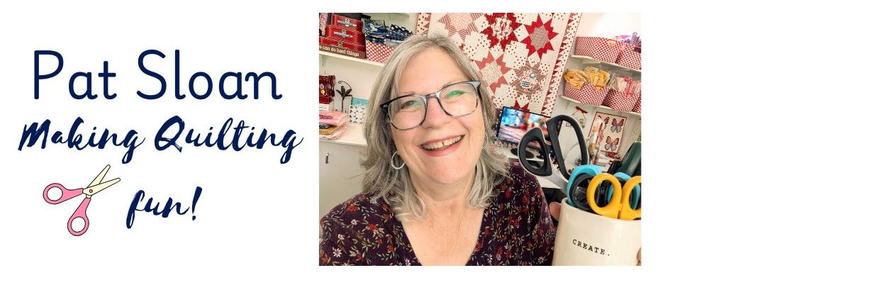
Are you enjoying my new site ‘I Love to Make Quilts’? I sure am!! It’s SEW exciting to see your Solstice blocks pop up on Wednesday! My goal is a twice a week post for this website, the second will be either another fun quilt along I am hosting, maybe a cool deal I spotted, or a free pattern!
Enter your Email for my Notices

photos courtesy of APQ magazine
Each year APQ magazine hosts a Grand Quilt Along and it’s incredible fun to see all the variations! Lots of designers and bloggers join in. (Details)
We start NOW by making one of the 3 patterns, the Blue version is nice BIG squares, the red scrappy version, or at their website you can do one logcabin block, just for a ‘taste’ of it!
- Get the Blue verison pattern In Quilts & More from HERE
- The Red Strippy is in the APQ issue that subscribers get next week, you should find in the stores very soon

I have this bundle of Kate Spain Grand Canal that I want to play with, I love it!
I am kind of a Kate Spain groupie… shhh .. don’t tell anyone

Since what I have right now is a Fat Eight bundle, I might buy a few more 1/2 yd pieces, then I am pretty sure I will convert a few rectangles in the blue version to scrappy strips like the red version..
Question for you….
I am going to leave one color out, which would you remove?
The Goodies!
- Grand Canal Fabric, I so love this!
- Aurifil Thread
- Quilts & More Magazine Here
- American Patchwork & Quilting Subscription
- Quilt Along Details at American Patchwork & Quilting

Article continues below this Ad
172 Responses
I think I’d probably leave out the green ones on the bottom left. I thought about ditching the orange, but it actually really pops with the other colours there 🙂 This is certainly a beautiful fabric range.
The green, not much of it and I don’t think it would make much of a difference.
I’d leave out the two lime green ones.
I would leave out the darkest blue floral at the top. The others are more pale and medium tones. The darkest blue would not be missed.
I would definitely leave in the orange. I would most likely leave the yellow out. I adore bright colors.
I would leave out the orange. When I see orange I think Halloween that is the only time I would use orange. But then I don’t like orange.
I would leave out the two yellows at the bottom.
I think you’ll leave out the purples. There’s one about at 4 o’clock on you circle that is too dark.
The one that’s glaring at me is the red between the pink and the blue/yellow fabric.
Leave out the green! For no other reason than I don’t care for it! Love the rest. I’m not very good at color coordinating. lol
The lime green….there is enough green in some of the other swatches of material.
There are 2 prints by the yellows at the bottom that are very similar I would remove one because the 2 are so close. Depending on the size of the pieces you may not get the result you are looking for.
i love orange too Jane!
oh but the house print is my favorite! It’s staying.. wink!
Leave out that yellow. The quilt will really shine with the deletion of those fabrics.
In the upper right corner, right next to the dark navy blue is a baby blue background with looks like houses and red roofs. There seems to be another at the bottom with a slightly darker light blue background with the same red roofs. I would remove those because everything else seems to be of floral designs and seems they would be odd man out.
Hi Pat, Jane from Australia here; I’d remove the pink and use it elsewhere.Myself I love orange contrasting with green and blue. So many choices; great fabric line so really you can’t go wrong! I do enjoy your posts!Thanks🐨
I love the fabric, but if I had to leave out a color I would leave out the green.
I’d leave out the light blue. Keep it dark color saturated.
I like all the colors, but the orange one is my least favorite.
I, too, love Kate Spain’s fabrics! And I have a FQ bundle of Grand Canal waiting for inspiration to strike. If I had to leave one fabric out, it would be the deep pink (it almost looks purple). I will be interested in what you come up with. Who knows? Maybe I’ll sew right along with you!
I see I agree with quite a few people, leave out the orange. I love Kate Spain. I’m doing the Children’s Library and I’m using a Christmas bundle by Kate Spain. 🙂
Orange, I’d leave the orange out.
The 4 dark blues
Beautiful fabric. i would leave out the purple.
Awesome fabrics! I’d leave out the lavender/pink, if I had to leave one out – like the orange.
I would remove orange but that could be because it isn’t my favorite color. Yellow would be my second choice because it can take over a quilt easily. I like the colors together ❤️
I would leave out the yellow. I love yellow, but I think you can do without it.
Take out the pink but leave purples.
Difficult choice. I see 3 pinks/magenta pieces that could go or there are 3-5 of the teal pieces without any of the yellow, green or orange colors in them. It’s fun to see all the different perspectives. A mini course on color theory.
Beautiful collection. If you are skipping one, the dark magenta shouted too much.
BTW, this fabric would be pretty awesome in the Solstice blocks as well. Great new site.
I would leave out the dark pink. There seems to be enough of that color in various prints that no further dark pink would add much. For some reason the orange and white leaf print should be left out as well. I just don’t think the print brings much to the scheme of things.
The purple could be removed and not missed.
The pink/purple has to go……………..everything else is perfect…………..
It was hard to choose, but I thought green because you don’t have red. You have all the opposites of the color wheel on the remaining fabrics.
Hi Pat … such beautiful fabrics they are! … since your asking, I would pull
out the Purplish Lavenderish & Maroonish ones … some say Pink but my eyes aren’t seeing Pink. Orange must stay … and we’re On Our Way!!! ….lol
LOVE the Solstice 🙂 AND the New Site …
There is one purple you wouldn’t miss, it has some white flowers and other prints in it. The rest are going to look so happy together.
I would leave out the pink including that dark purple.
I would pull the pink, I can’t visualize it with the others
Hi Pat! I just made a couple totes with “Grand Canal”, and I would definitely leave out the yellow. You’ll make the right choice for you! -Jean
Leave out the pink. Just doesn’t do much for the whole look of the group.
Leave out the three greens between the yellows and the teal, the orange gives it a lift.
I would leave out the two neon greens…. 😉
I would leave out some, but not all of the light blues.
I’m going against the grain here – plus I know, it’s one of your favs, Pat – But my vote is leave out the aquas in this one. I held my hand against each of the color groups starting with the orange and ending at the aqua thinking that would be the first to go (orange) and the last to stay (aqua), but actually really liked the look of the colors without the aqua the best. You may need that aqua for light/dark contrast though now that I think of it. I am not the greatest color picker/chooser! Still learning how to combine the fabrics I like to look nice in a quilt!
I would leave out the pink – but never the orange. I would rather leave out lights if I had to in favour of darks.
I would leave out the pink. Just not a fan of that shade. Love the orange.
I would leave out the orange, the yellow, the pinks, and keep all the blues and greens. But that is just me. I am not much of an orange or yellow or purple person.
But I like Kate Spain ~ just not orange.
I would leave out that deep red purple. It really stick out like a sore thumb. This is a beautiful collection of fabrics! I am always motivated by all your postings! Working through the UFO’s before I create any more of them, but this collection would be under my machine in a second.